TLDR
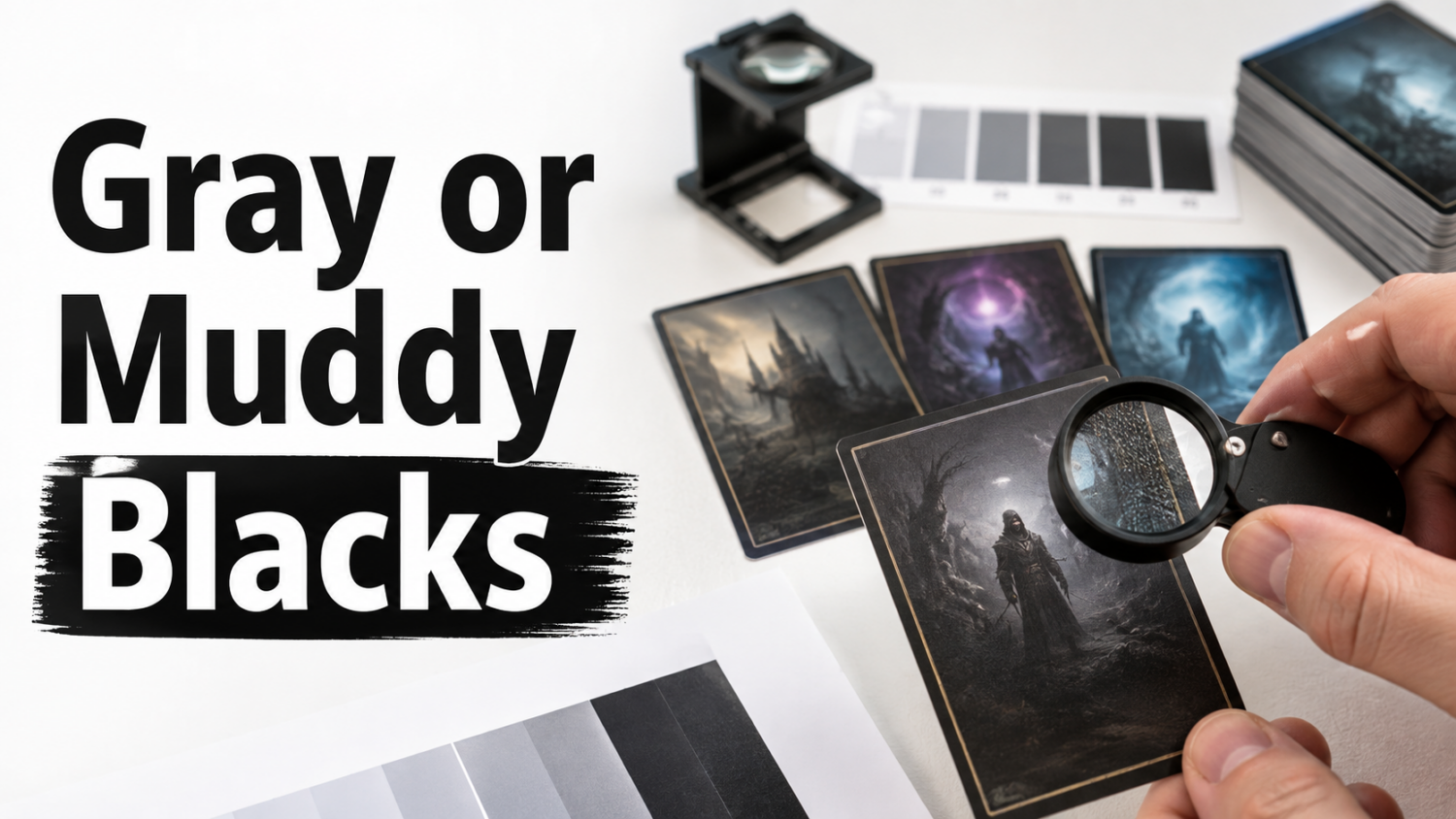
- Black areas print gray when the printed black lacks enough visual density, the surface scatters light, or the file uses a weaker black construction than expected.
- Black areas look muddy when dark tones merge together, shadow detail disappears, or several color channels create an unbalanced dark mixture.
- Inspect text, borders, artwork, and shadows separately. They do not always fail for the same reason.
- Colored fringes around black text suggest registration or composite-black problems, not merely weak density.
- For custom files, use the printer’s profile, protect shadow detail, use printer-approved rich black only for large areas, and never use registration black as a design color.
Understanding why black areas print gray or muddy requires separating two complaints that often get bundled together.
A gray black lacks density. It looks washed out, charcoal, or faded.
A muddy black may be dark enough, but the shadows have merged into a flat mass. Hair, armor, clouds, stone, fabric, and card-frame details all become the same heavy tone. Sometimes the area also develops a blue, red, green, or brown cast.
Neither problem is rare. Black is one of the simplest colors on a screen and one of the more complicated colors in print. Printing enjoys these small betrayals of common sense.
Why Black Areas Print Gray or Muddy
Several different problems can produce a similar-looking result.
The Screen Displays a More Convincing Black
A monitor can create near-black by reducing the light emitted from a pixel. The surrounding screen is still luminous, which gives dark areas strong contrast.
A printed card depends on pigment or toner absorbing reflected light. The darkest printable black may still appear lighter than an illuminated RGB black, particularly on a matte or satin surface.
Adobe’s soft-proofing tools even include options to simulate the dark gray that some printers produce instead of an ideal solid black. That difference is normal within limits.
The File Uses Pure Black Instead of Rich Black
In CMYK printing, 100 percent black ink is commonly written as:
- C: 0
- M: 0
- Y: 0
- K: 100
This is often called pure black or process black.
Pure black is appropriate for small text, fine lines, and other elements where registration accuracy matters. In large solid areas, however, it may look less dense than a properly constructed rich black.
Rich black combines black with controlled amounts of cyan, magenta, or yellow. The supporting colors can produce a deeper and more saturated appearance.
But the correct formula depends on the printing equipment, paper, coating, and production profile. A formula recommended for a book printer should not automatically be copied into a proxy-card file.
The File Uses Too Much Composite Black
More color is not always more black.
Adding large amounts of cyan, magenta, yellow, and black can create excessive total coverage. On traditional press workflows, too much ink can cause drying and offset problems. In other processes, heavy dark builds can still reduce detail, alter color balance, or create an unpleasant solid mass.
Registration black, which uses 100 percent of every process color, is intended for production marks and plate alignment. It is not a supercharged design black.
Do not use it for card backgrounds, text, borders, or artwork.
Shadow Detail Was Already Crushed
A dark image can look dramatic on a monitor while containing very little usable information in its deepest tones.
If several neighboring shadow values are already almost identical, the printing process may compress them into one apparent black area.
This produces:
- Faces without visible features
- Fabric without folds
- Dark clouds without separation
- Black frames that merge with the artwork
- Rules boxes that feel heavy
- Stone, metal, or hair that becomes an indistinct blob
The printer cannot restore detail that is absent from the file. Printing generally makes poor shadow separation more noticeable, not less.
The Dark Area Contains a Color Cast
A neutral dark area should not necessarily be made from equal amounts of every process color.
An imbalance can produce:
- Blue or cyan blacks
- Warm brown blacks
- Magenta shadows
- Greenish grays
- Different black tones between the frame and artwork
This may come from the source image, an incorrect profile conversion, inconsistent gray balance, or the printer’s production condition.
The Cardstock or Finish Changes the Apparent Density
Surface finish affects how light reaches the printed layer and returns to the viewer.
A gloss coating may make black areas look deeper from one angle but introduce bright reflections from another. Matte or satin finishes can soften contrast and make blacks appear less dense.
Stock color also matters. A warmer or less bright substrate changes highlights and overall contrast, even when the printed color values are unchanged.
The Printing Process Is Inconsistent
Production problems can include:
- Weak toner or ink density
- Banding
- Uneven fusing
- Coating inconsistency
- Gray-balance problems
- Color drift during the run
- Misregistration between color channels
- Variation between separate production batches
If identical cards from the same order have different black density, the file cannot explain the entire problem.
Inspect Text, Frames, and Artwork Separately
Do not judge every dark element as if it were produced the same way.
Check Small Black Text
Rules text and fine black lines should look sharp and neutral.
Watch for:
- Colored halos
- Double edges
- Fuzzy letterforms
- Weak gray text
- Filled-in counters inside small letters
- Text that changes density from card to card
Colored fringes around black text may indicate that the text was built from multiple color channels or that those channels did not register precisely.
Check the Card Frame
Compare the black border, rules box, and other repeated frame elements across several cards.
If the frame is consistently black but the artwork is muddy, the source images are more likely to be responsible.
If every black element, including text and borders, looks weak, the issue may involve print density, stock, coating, or the production profile.
Check the Artwork Shadows
Look for recognizable detail in:
- Hair
- Armor
- Robes
- Tree lines
- Clouds
- Buildings
- Stone
- Night skies
- Dark creature faces
A dark area does not need to be bright, but it should preserve enough separation to communicate the image.
Tilt the Card Under the Light
A glossy reflection can make a dense black look gray from one angle. Tilt the card and determine whether the problem moves with the reflection.
If the gray appearance changes dramatically with angle, the finish is contributing. If it remains fixed within the artwork, the printed tone is the stronger suspect.
Fast Diagnostic Guide
Text Is Sharp and Black, but the Artwork Is Muddy
The artwork probably contains crushed shadows, excessive contrast, poor tonal separation, or an unsuitable source image.
Everything Black Looks Gray
Possible causes include weak overall print density, an unsuitable black conversion, a soft matte appearance, or a production problem.
Compare several cards and inspect the order under different lighting.
Black Areas Have a Blue, Red, or Green Cast
The dark mixture may be unbalanced, or the production gray balance may have shifted.
Check whether the cast affects the entire order or only selected files.
Black Text Has Colored Fringes
This suggests multiple color channels, misregistration, or both.
Fine text normally benefits from a single black channel in traditional CMYK file preparation because it avoids requiring several colors to align perfectly.
Only Certain Cards Are Muddy
Check those specific source images. Different scans and exports may have different black points, profiles, and contrast curves.
The Whole Order Is Muddy
The common factors are the printer, cardstock, finish, production profile, or a batch-wide file conversion.
Practical Black-Quality Severity Guide
These are editorial inspection categories rather than universal printer tolerances.
Normal Variation
- Printed black looks slightly lighter than the monitor
- Matte finish softens contrast
- Deepest shadows lose a small amount of separation
- Black remains neutral
- Text remains crisp and readable
- Appearance is consistent across the order
This usually does not justify a reprint by itself.
Concerning Result
- Several dark cards lose meaningful detail
- Black areas have an obvious color cast
- The frame and artwork use noticeably different blacks
- Fine text looks heavier or softer than expected
- Dark cards are consistent with each other but substantially worse than a supplied proof
Inspect the original files and the seller’s published specifications before determining responsibility.
Likely Production Defect
- Identical cards have different black density
- Banding crosses black areas
- One portion of the order is gray while another is dense
- Black text has obvious colored fringes
- Neutral blacks shift strongly toward another color
- Coating inconsistency changes the appearance across cards
- Text or important artwork becomes unreadable
- The physical result materially fails the seller’s published quality standard
How to Document Gray or Muddy Blacks
Provide evidence that separates source problems from production problems.
Include:
- The order number
- The number of affected cards
- Group photographs under neutral light
- Duplicate cards placed next to one another
- Close-ups of text, frames, and shadow areas
- Examples of unaffected cards from the same order
- Original source files
- Any approved proof or previous physical sample
- A description of whether the issue changes with viewing angle
- A note identifying whether all cards or only certain designs are affected
Avoid editing the complaint photographs. Strong contrast adjustments may make the defect easier to see, but they also make the evidence less dependable.
A flatbed scan can help show banding and detail loss, although the scanner’s own processing may alter black density and color.
How to Prepare Better Black Areas for a Reorder
Use the Printer’s Recommended Color Workflow
Follow the provider’s current instructions for RGB, CMYK, embedded profiles, and file format.
Do not convert to a random CMYK profile merely because the job will eventually be printed. The wrong conversion can damage shadows before the printer receives the file.
Use Pure Black for Small Text and Lines
When preparing a true CMYK design, small black text and fine line art generally benefit from 100 percent black without supporting color channels.
This reduces the risk of colored fringes caused by registration variation.
Rasterized card images may not give you independent control over the text channels. In that case, use the highest-quality source available and avoid unnecessary conversions.
Use Rich Black Carefully for Large Areas
A printer-approved rich black can improve the density of large black fills.
Do not invent the formula. Ask the printer for:
- Its preferred rich-black build
- Maximum total coverage
- Recommended RGB or CMYK profile
- Whether it converts uploaded files automatically
- Whether black text should remain single-channel
A formula appropriate for one press can be excessive or poorly balanced on another.
Never Use Registration Black as Artwork
Registration black is a production tool, not an aesthetic upgrade. It can create excessive coverage and make registration problems much more visible.
Lift Shadows Instead of Brightening Everything
When artwork prints muddy, the most useful correction is often a gentle adjustment to the darkest tones.
Try to:
- Preserve highlight brightness
- Separate near-black values
- Lift the deepest shadows slightly
- Reduce extreme contrast
- Avoid flattening every dark region into pure black
- Inspect the frame and artwork independently
Increasing overall brightness may wash out the card without restoring the missing shadow detail.
Check Black Areas at Physical Size
A shadow that looks textured at 400 percent zoom may collapse when reduced to a 63 by 88 mm card.
Review the image at actual card size and confirm that the important dark forms remain distinguishable.
Print a Representative Test Set
Include:
- Black text on a light background
- White text on a black background
- A large solid black area
- A dark image with fine shadow detail
- Neutral gray
- Warm and cool dark artwork
- Smooth dark gradients
- A black card frame
A physical test reveals more than another hour of comparing two glowing screens.
When to Request a Reprint
Request review when the physical evidence suggests that the printer failed to produce a consistent order.
The strongest cases involve:
- Major variation between duplicate cards
- Banding or uneven coverage
- Colored registration fringes
- Batch-wide gray or tinted blacks
- Unreadable text
- A finish defect
- A result that clearly fails a published consistency or print-quality guarantee
A subtle difference between the card and an uncalibrated monitor is less persuasive. So is a muddy result caused by an already crushed source file.
Some sellers explicitly cover printing, finishing, and color-consistency defects while excluding customer-provided file problems. Read the current policy and submit evidence promptly.
Final Assessment
Black areas print gray or muddy for several distinct reasons. The monitor may be showing an unrealistic black, the file may contain weak or excessive black construction, the artwork may lack shadow separation, or the production process may be inconsistent.
Inspect small text, repeated frame elements, large fills, and artwork shadows separately. Then compare multiple cards.
If every duplicate looks different, black text has colored fringes, or the order contains obvious banding and density changes, the printer deserves a closer look. If only one compressed night scene has become an indistinct cave wall, the source file may have arrived with a shovel.
FAQs
Why Does 100 Percent Black Print Gray?
A single black channel may appear less dense in a large printed area than a properly constructed rich black. Paper, coating, and viewing light can reduce the apparent density further.
Should I Use Rich Black on MTG Proxy Cards?
Use rich black only for large fills when the printer recommends a specific formula. Small text and fine lines usually benefit from a single black channel in a CMYK workflow.
Why Do Dark Proxy Cards Lose Artwork Detail?
The source may contain crushed shadows, and the printing process can compress already similar dark values into one apparent tone.
What Causes Colored Edges Around Black Text?
Colored edges commonly indicate that the text contains multiple color channels and those channels did not align perfectly during printing.
Does Matte Finish Make Black Look Gray?
It can. Matte and satin surfaces scatter reflected light, which may soften contrast and reduce the apparent depth of black areas.
Will Converting the Image to CMYK Fix Muddy Blacks?
Not automatically. An unsuitable conversion can make the problem worse. Use the printer’s requested profile and inspect shadow separation before converting.
References
- “Proofing Colors in Photoshop,” Adobe. Explains soft-proof simulation of paper color, printed black, output profiles, and shadow-detail compensation. Accessed August 5, 2026.
- “Color Separations in Adobe InDesign,” Adobe. Explains rich black, total ink coverage, separation preview, trapping, and press-specific limits. Accessed August 5, 2026.
- “CMYK Black Values,” Blurb. Provides a printer-specific example distinguishing rich black for large areas, single-channel black for text, and registration black that should not be used for design. Accessed August 5, 2026.
- “Designer Tips,” The Game Crafter. Discusses dark colors, printed grays, color variation, toner behavior, stock edges, and the limits of exact color matching. Accessed August 5, 2026.
- “MTG Proxy Color Consistency,” PrintMTG. Proxy-specific provider guidance on crushed shadows, dark frames, tonal normalization, soft proofing, and muddy dark areas. Accessed August 5, 2026.
- “Quality Guarantee & Reprints,” PrintMTG. Example of a published policy covering sharp printing, consistent color, finishing, and production defects while excluding customer-file errors. Accessed August 5, 2026.