TLDR
- Proxy card colors look different from the screen because monitors produce light while printed cards reflect it.
- RGB files, printer color conversion, cardstock, coating, lighting, and monitor settings can all change the apparent result.
- A slight loss of brightness or saturation is normal. Heavy color casts, banding, inconsistent duplicates, or lost readability may indicate a defect.
- Compare cards under neutral lighting and inspect the order internally before relying on a screen comparison.
- For custom artwork, use embedded profiles, moderate monitor brightness, soft proofing when available, and a small test order.
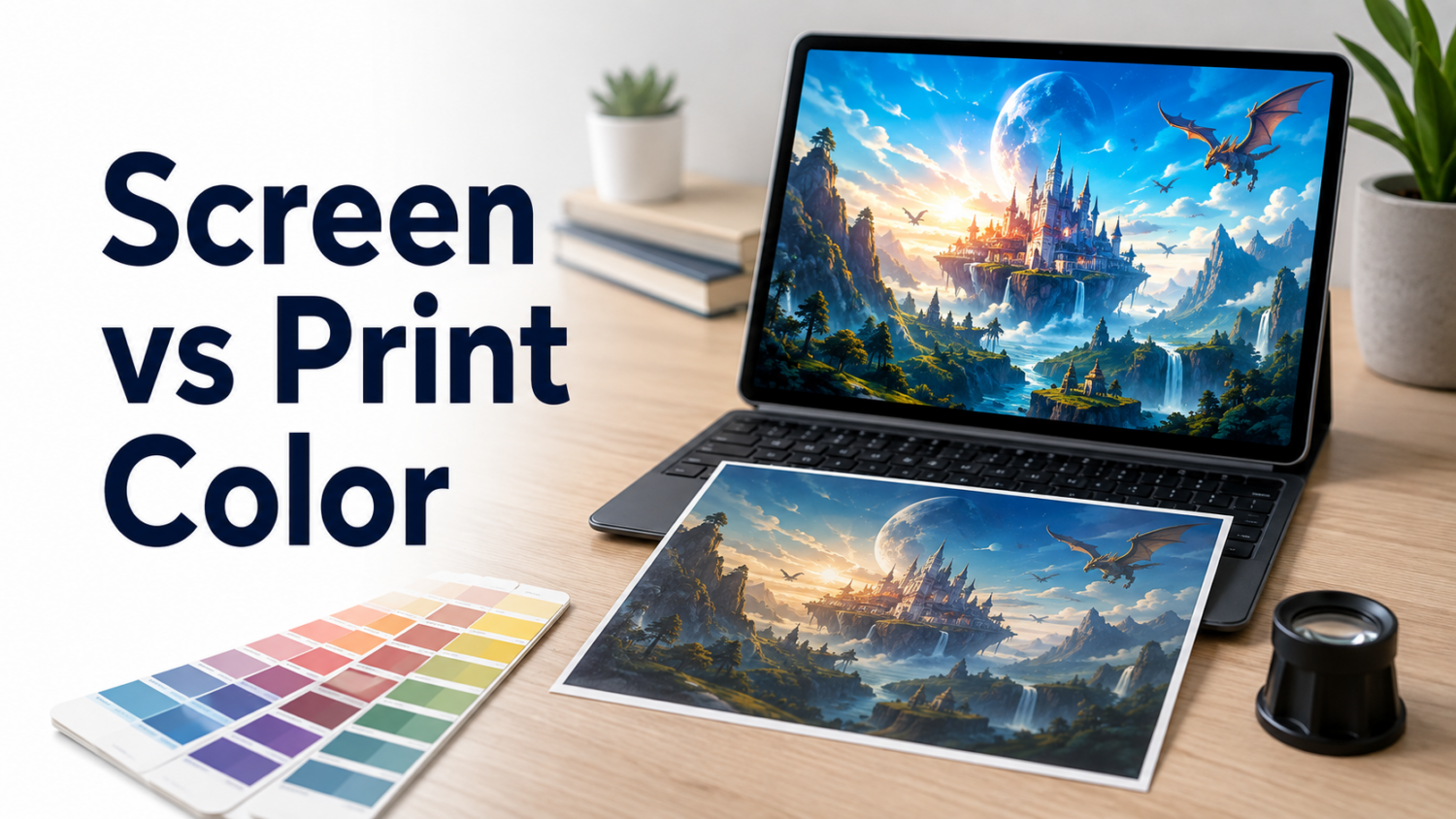
Understanding why proxy card colors look different from the screen begins with an inconvenient fact: a monitor is not a small printing press.
Your display produces color using red, green, and blue light. A printed card uses pigments or toner on a physical surface, then relies on room light reflecting back toward your eyes. The two systems can produce similar results, but they cannot behave identically.
A screen can display bright blues, glowing reds, deep shadows, and luminous highlights that paper cannot reproduce in exactly the same way. Add an uncalibrated monitor, automatic screen adjustments, several different source images, and a matte coating, and the phrase “it looked right on my laptop” stops being particularly strong evidence.
Why Proxy Card Colors Look Different From the Screen
The difference usually comes from several factors acting together.
Screens Emit Light
A monitor creates its own light. White areas can appear extremely bright, and dark colors are viewed beside illuminated pixels.
A printed card does not glow. Its brightness depends on:
- The whiteness of the cardstock
- The surface finish
- The amount and color of surrounding light
- The density of the printed pigments or toner
- Reflections and glare
This is why prints often appear darker and less luminous than the same image on a bright display.
RGB and Print Have Different Color Ranges
Most digital artwork is displayed in RGB. Commercial printing commonly converts those colors into a print-oriented color space or into device-specific instructions handled by the printer’s workflow.
Some highly saturated RGB colors cannot be reproduced exactly by a typical four-color printing process. Electric blues, intense greens, vivid purples, and bright reds are frequent trouble spots.
The printer must map an unavailable color to something it can physically produce. The replacement may appear darker, duller, or slightly shifted.
The Monitor May Be Misleading
Two monitors can display the same file differently.
Common causes include:
- Excessive screen brightness
- An inaccurate monitor profile
- Night-light or blue-light reduction modes
- Automatic brightness
- HDR display settings
- Manufacturer color-enhancement modes
- An aging display
- Viewing the file in software that ignores embedded profiles
A display set near maximum brightness can make a perfectly reasonable print look dark by comparison.
The File May Not Have a Reliable Color Profile
A color profile gives meaning to the numerical color values inside a file. Without one, different applications and output systems may interpret the same values differently.
An embedded profile does not guarantee a perfect print, but it reduces ambiguity. An untagged file leaves more of the interpretation to software defaults.
Cardstock and Finish Change the Result
The same printed image can look different on:
- Bright white versus warmer stock
- Smooth versus textured stock
- Matte versus gloss coating
- Laminated versus unlaminated surfaces
- Different black-core or blue-core cardstocks
Gloss may increase apparent saturation and contrast but introduce reflections. Matte or satin finishes may look softer and slightly less dense under some lighting.
The finish is part of the color result, not merely something applied after printing.
The Source Images May Already Be Inconsistent
A 100-card proxy deck may contain artwork from many scans, exports, websites, and editing workflows.
One image may have:
- Deep crushed shadows
- Heavy saturation
- A cool color cast
- Aggressive sharpening
- JPEG compression
- Lifted blacks
- A missing profile
Another may be bright, flat, and warm. The printer can reproduce both consistently while the deck still looks inconsistent.
Inspect the Cards Before Comparing Them With a Screen
The first comparison should be card against card, not card against monitor.
Lay out 15 to 20 cards and look for patterns:
- Is the entire order slightly darker?
- Are only a few cards affected?
- Do neutral areas lean red, blue, green, or yellow?
- Do duplicate copies of the same image match?
- Are the darkest cards losing detail?
- Is there banding or blotchy color?
- Does the finish look consistent?
- Are text and symbols still readable?
If every card has a similar character, the result may reflect the selected stock, coating, or production profile. If only certain images look wrong, inspect those source files.
If identical cards printed in the same order look substantially different, the evidence points more strongly toward a production-consistency problem.
Use Neutral Viewing Conditions
Color evaluation becomes unreliable under strongly colored light.
For a basic inspection:
- Use indirect daylight or a neutral white work light.
- Avoid orange household bulbs and strongly blue lighting.
- Keep the cards away from colored walls or bright objects.
- Turn off Night Shift, Night Light, True Tone, and similar display adjustments.
- Reduce an excessively bright monitor.
- View the digital image at approximately the physical size of the card.
- Compare several cards at once.
Colors can also change appearance under different light sources. This phenomenon is called metamerism. A card that looks neutral in daylight may appear warmer or greener under an LED lamp.
Check the cards under more than one ordinary light source, but use consistent neutral lighting when photographing a complaint.
Normal Screen-to-Print Differences
The following differences are often normal:
- The printed card looks slightly darker.
- Extremely bright colors are less saturated.
- Deep shadows have somewhat less separation.
- Matte cards look softer than the screen image.
- Glossy cards appear more saturated at one angle and more reflective at another.
- Whites resemble the cardstock rather than the monitor’s illuminated white.
- Very subtle color gradients become less obvious.
A printer cannot guarantee that a physical card will match every phone, tablet, and monitor. Those devices do not even agree with one another.
Signs of a Possible Printing Defect
A reprint request becomes more reasonable when the issue is measurable within the physical order rather than based only on one screen.
Document the problem when:
- Identical cards have visibly different colors.
- A group of cards has a strong color cast not present elsewhere.
- Neutral gray areas print distinctly green, magenta, blue, or yellow.
- Heavy banding crosses artwork or text areas.
- Colors vary abruptly within one card.
- Important shadow detail disappears completely.
- Rules text becomes difficult to read.
- The coating or finish varies across the order.
- One portion of the order looks substantially different from another.
- The result differs materially from an approved physical proof or earlier test order.
A general statement that the cards are “less vibrant than my phone” is weaker evidence. A photograph showing six copies of the same design in three different shades is much stronger.
Practical Color Severity Guide
These are editorial inspection categories, not universal seller policies.
Expected Difference
- Slightly darker or less luminous than the display
- Small saturation changes
- Consistent appearance throughout the order
- Text and shadow detail remain readable
- Difference changes with lighting or viewing angle
This normally reflects the difference between an illuminated display and printed material.
Concerning Difference
- Noticeable overall color cast
- Dark cards lose meaningful detail
- Some groups look substantially different
- Grays no longer appear neutral
- The cards are consistent with each other but far from a provided proof
Review the source files, seller specifications, and proofing process before assigning responsibility.
Likely Production Problem
- Duplicate cards do not match
- Severe banding or blotching is visible
- Color changes across a single solid area
- The order contains multiple obvious color states
- Important content becomes unreadable
- Finish or coating variation changes the color dramatically
- The seller’s published consistency standard is clearly not met
How to Document a Color Complaint
Color photographs can be deceptive because phones automatically adjust exposure, white balance, contrast, and saturation. Still, careful photographs are useful.
Provide:
- The order number
- The number of affected cards
- A group photograph under neutral lighting
- Close-ups of representative cards
- Duplicate cards placed beside one another
- A sheet of plain white paper in the scene
- The original source files
- Screenshots of any approved preview
- Details about whether the problem affects all cards or only certain designs
- Photographs taken without filters or editing
Do not photograph one card beneath an orange lamp and compare it with a phone screen set to maximum brightness. That arrangement has already chosen chaos.
A physical sample or returned card may be necessary when the dispute depends on subtle color differences.
How to Get More Predictable Proxy Card Colors
Follow the Printer’s File Instructions
Do not convert every image to CMYK merely because the final product is printed.
Some services want RGB files and perform conversion through their own production profile. Others provide a specific CMYK or ICC workflow. Follow the current instructions for the actual printer.
Embed a Recognized Profile
For ordinary RGB uploads, an embedded sRGB profile is often safer than an untagged image when the printer accepts RGB. Do not assign a new profile randomly, because assigning and converting are not the same operation.
Calibrate the Monitor
A hardware calibration device provides the strongest result, but basic improvements still help:
- Disable display enhancement modes.
- Use a neutral desktop background.
- Avoid editing at maximum brightness.
- Let the display warm up.
- Recheck the image on a second reasonable device.
Soft Proof When Possible
Soft proofing uses an output profile to simulate how a printer and paper combination may reproduce the file.
It cannot predict every press variation or coating effect, but it can reveal:
- Out-of-gamut colors
- Darkened shadows
- Reduced black density
- Paper color
- Contrast loss
The proof is only as reliable as the monitor, output profile, and viewing environment.
Protect Shadow Detail
Dark proxy artwork is often the first material to fail.
Instead of brightening the entire card:
- Lift the deepest shadows slightly.
- Preserve separation between dark tones.
- Avoid crushing large areas into one black value.
- Check the frame as well as the artwork.
- Review black cards, artifacts, night scenes, and full-art layouts carefully.
Order a Test Batch
A small physical test is more useful than repeatedly debating which monitor is correct.
Include:
- A bright card
- A neutral card
- A dark card
- Saturated red, blue, and green artwork
- Fine text
- Smooth gradients
- A card with difficult shadow detail
Use the results to prepare the larger order.
Final Assessment
Proxy card colors look different from the screen because the screen and printed card use different technologies, different color ranges, and different methods of producing visible light.
A moderate screen-to-print difference is expected. What matters is consistency, readability, neutral balance, and whether the result reasonably reflects the submitted file under controlled viewing conditions.
Evaluate the cards as a physical group first. Then compare them with a sensibly configured display. Color complaints are strongest when identical cards disagree with one another, not merely when a backlit monitor wins a brightness contest against a piece of cardstock.
FAQs
Should MTG Proxy Cards Match My Monitor Exactly?
No. A printed card cannot match every display exactly because monitors differ and printed materials reflect light instead of producing it.
Why Do My Proxy Cards Look Darker Than the Digital Image?
The monitor may be too bright, the printed material may have a smaller tonal range, or the artwork may contain shadows that become denser during printing.
Should I Convert Proxy Card Artwork to CMYK?
Only when the printer specifically requests it or provides a suitable workflow. Blind conversion can create new problems and does not guarantee accurate color.
Does Matte Coating Make Proxy Cards Look Duller?
It can. Matte and satin surfaces scatter light differently from glossy surfaces, which can reduce apparent saturation or contrast under certain lighting.
Can I Use a Phone Photograph to Prove a Color Defect?
A photograph can document major inconsistencies, especially when several cards appear together. It is less reliable for proving subtle color differences because phones automatically modify exposure and white balance.